Header

User level: Site Owner; Site Administrator

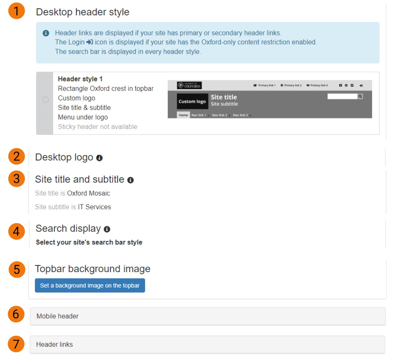
The Header tab provides options to select your site's desktop and mobile header style, search bar style, and to manage logos, social media links and header links.

Screenshot of Site Settings header tab with seven labelled customisable options for desktop header


Expand All

Header links are displayed as text and/or icons if your site has primary or secondary header links configured.

The Login icon is only displayed if your site has the Oxford-only content restriction enabled.

The search bar is displayed in every header style and its position in the main region is fixed.

Site title and subtitle will not display at all in style 2 even if they are added to the Site Details tab and set to display. Site title and subtitle will only display in styles 1 and 3-6 if the title and subtitle are set to display in the Site Details tab.

There are six desktop header styles available:

Style 1 (default for new sites)

desktop header style 1

Features: 

Rectangle Oxford crest in top bar ; Custom logo ; Site title and subtitle ; Menu under logo ; Sticky header not available

Style 2

desktop header style 2

Features:

Square Oxford crest in main region ; Custom logo ; No site title and subtitle ; Menu under logo ; Sticky header not available

Style 3

desktop header style 3

Features:

Square Oxford crest in main region ; No custom logo ; Site title and subtitle ; Menu under logo ; Sticky header not available

Style 4

desktop header style 4

Features:

No Oxford crest ; Custom logo ; Site title and subtitle ; Menu under logo ; Sticky header not available 

Style 5

desktop header style 5

Features:

Rectangle Oxford crest in top bar ; Custom logo ; Site title and subtitle ; Menu next to logo ; Sticky header available

Style 6

desktop header style 6

Features:

No Oxford crest ; Custom logo ; Site title and subtitle ; Menu under logo ; Sticky header available

Desktop logo

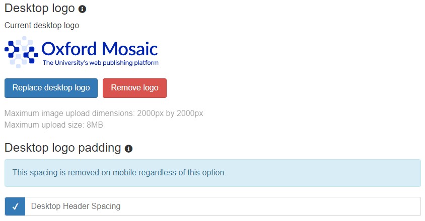
You can choose to upload a custom site logo which will be used if you select the appropriate header style. It will also be displayed on mobiles if a mobile logo has not been uploaded in the Mobile Header settings.

This image will be scaled to a maximum height of 115px, while maintaining the aspect ratio of the image. Uploading images that have a very wide (landscape) aspect ratio may cause layout issues at lower screen widths. It is therefore recommended that you don't upload images with an aspect ratio greater than 2:1. 

Maximum image upload dimensions: 2000px by 2000px

Maximum upload size: 8MB

Screenshot of header site settings for uploading or replacing a desktop logo and option to use logo padding

Padding applies extra space above the logo.

Sticky header

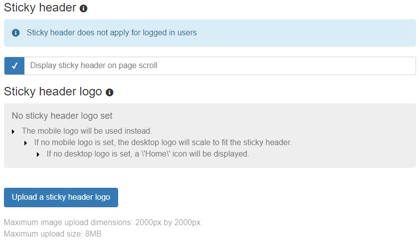
If you select a header style which supports sticky header, you can upload a separate logo. "Sticky" means the header will be displayed when you scroll down on the page. A new settings option is shown after Top bar background image:

Screenshot of Sticky header in Site Settings showing option to display

After you select "Display", the menu expands to allow you to upload a logo:

Screenshot of expanded Sticky header in Site Settings showing upload logo button

Mobile logo (Mobile Header settings)

You can provide a different logo to use on mobiles and tablets (screens less than 991px wide). This allows you to provide a version of your logo appropriate for use at a smaller scale. For example, you may wish to exclude any smaller pieces of text such as a strapline or omit the logo image and use text only.

The logo is scaled to display at 56px tall. The amount of space available for the logo varies by header style and the number of buttons displayed in the header. To make sure the logo displays correctly at all viewport sizes, stay within the maximum logo dimensions:

'One-level' header style:

+2 buttons (e.g. Search + Menu): max logo dimensions are 7:2

+3 buttons: max logo dimensions are 5:2

+4 buttons: max logo dimensions are 3:2

'Two-level' header style: max logo dimensions are 7:2

You can check how your header will display by using mobile preview.

Site title and subtitle will be shown in Header settings if the fields are populated and set to display in the Site Settings > Details tab. We recommend using a short subtitle to avoid layout issues.

There are two styles available for the search bar which appears on your site header. The position of the search bar is the same for all header and search bar styles.

  • Standard style defines the text input area and submit button using background colour 
  • Slimline style defines the input area with an underline colour 

You can also opt to display placeholder text in the search bar: "Search this site". 

Screenshot of header site settings for search display options for standard or slimline and option to show placeholder text

Search break point

For larger menus, the search box may collide with the menu at smaller screen sizes. To prevent this, you can set the Search to collapse and behave like the mobile Search. “Collapsing” means the search bar is represented by the Search  icon. The search bar will still convert to the Mobile search on screens smaller than the Mobile breakpoint (991px).

The default Mosaic break point is 1450px. 

*Header top bar and footer background image configuration is available to Site Owners via Site Settings > Advanced

A background image can be applied to the header top bar. When applied, the background image overrides the existing colour setting for the top bar background; the text colour setting still applies. The background image is set to tile (repeat) across the region it has been placed in. Therefore, if a small image is uploaded, it will repeat to fill the area.

Please note that when placing a background image, you need to consider the legibility of the text that will appear on top of it. To ensure text legibility, we recommend that you:

  • use images that are predominantly the same tone
  • use images that are either mostly dark or mostly light (avoid images which are mostly mid-tone)
  • set the text colour of the text appropriately (i.e. very dark text on a light image, or very light text on a dark image)
  • once in place, review your background image / text colour combination to assess the legibility.

Add a top bar background image

To add a background image to the top bar from Desktop header settings:

  • select 'Set a background image on the top bar'
  • this takes you to the Site Settings - Background images page. Under the 'Top bar background image' section, use 'Browse' to select an image from the Media Browser or upload a new image
    header top bar and footer background image settings
  • once the preview has loaded, click 'Save configuration'.

The Home icon is displayed if there is neither a mobile logo nor a custom site desktop logo uploaded.

The Header Links  icon is displayed if your site has primary or secondary header links.

The Login icon is only displayed if your site has the Oxford-only content restriction enabled.

If you provide a short site title in Site settings / Details tab, you can opt to display it as the Home link rather than using a Mobile or Desktop site logo or Home icon.

Search  and Menu  icons are shown on all header styles.

There are three mobile header styles available:

One-level

mobile header style 1

Features:

No Oxford crest ; 'Home' icon or Site logo or Short site title

Two-level with crest

mobile header style 2

Features:

Oxford crest in top bar ; 'Home' icon or Site logo or Short site title in bottom bar

Two-level no crest 

mobile header style 3

Features:

No Oxford crest ; 'Home' icon or Site logo or Short site title in bottom bar


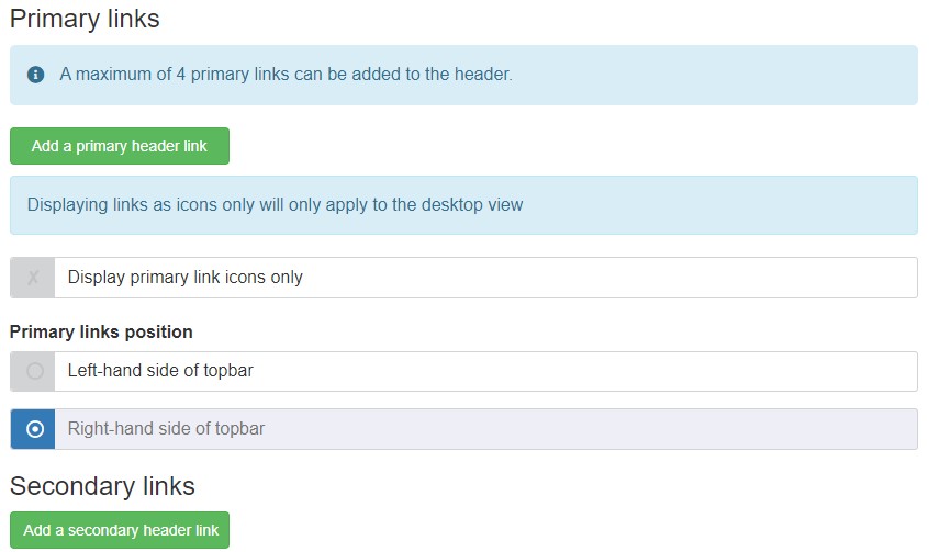
The Header links section allows you to place links to appropriate websites, social media accounts, and pages on your own site which are regularly accessed by your end-users. Links are located in the top bar section of the header and you can allocate an appropriate icon for a link and choose to display as icons only. Displaying links as icons only will only apply to the desktop view because the presence of links is represented by the  icon on mobile devices.

Screenshot for Header tab in Site Settings showing options to add primary and secondary links and placement of primary links

If you are adding to an existing list and have re-ordered the links, remember to save before adding a new link.

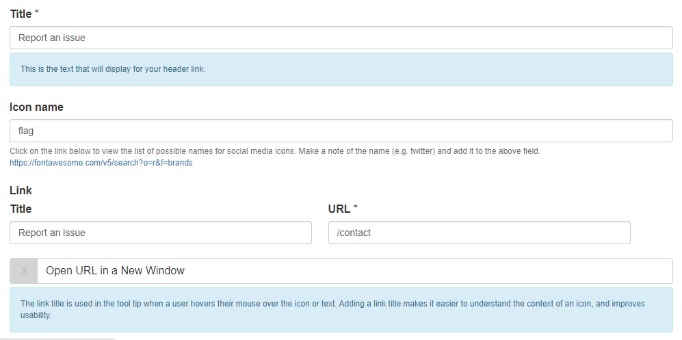
To add a new link, use the 'Add a primary header link' or 'Add a secondary header link' button. This will take you to the Create Header Link form page. The following screenshot is an example of a completed new link page:

Screenshot of edit view for a secondary link

The Title field will be the name used for the text of the link displayed in the header. It will also appear like this in the list of Primary or Secondary Links in Site Settings.

The Icon name is used to select an appropriate Font Awesome icon for your link. The form provides a link to Font Awesome's searchable listing of all available icons and their names. Your chosen icon will be displayed next to the link title text.

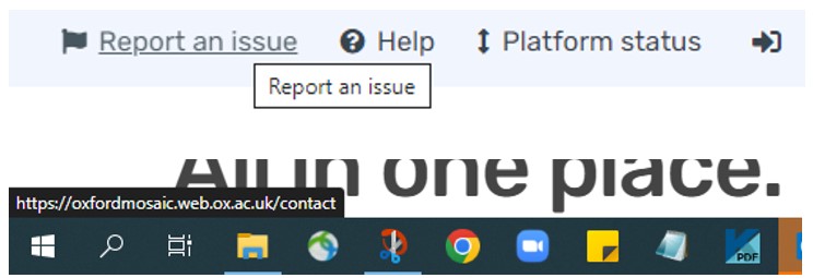
The Link element consists of two fields. The text in the Title field is shown when hovering over the link or icon with a mouse. This text can add context and improve usability. You enter the web address for the link in the URL field and can opt to open the link in a new browser window.

This is how the link with the above settings is shown when hovering over it in the header, with the web address it links to being displayed at the bottom of the screen:

Screenshot of secondary link tool tip text and web address it links to

Once you have saved links, you can control the order of how they appear by dragging items up and down the list using the drag handles icon:

Remember to 'Save order'.

You can add up to four Primary links. The number of Secondary links is not currently capped, but be mindful of top bar clutter. If you add too many as text links, they could interfere with the display of Primary links and might not display neatly on one row. Secondary links always display on the right-side of the top bar. If you select to display Primary links on the right-side, they will appear to the left of any Secondary links you have.

You can see examples of header styles in the Mosaic Pattern Book.